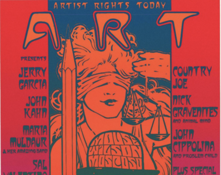
In the 1960s, artists switched to LSD, which opened a new direction — the one we today call trippy art. In the article, we will see how this art started and developed.
The desire to free the brain from banality is not a new idea for artists. Back in the very beginning of the 20th century Dadaists tried to get away from clear logical connections, surrealists experimented with the body. They were starving, taking alcohol and substances, and looking for meaning in dreams.
Psychedelics are the Trouble Child of the Art World
Artists have long considered creating under the influence of mind-altering substances a rather attractive process. Archaeologists note that psychedelic images began to be used in art many thousands of years ago. One example is rock art in the Sahara, where the drawings are very reminiscent of magic mushrooms.
The images became even more unusual after the discovery of LSD in 1938. Initially, Albert Hoffman assumed that he would create a respiratory stimulant, but discovered a psychotropic substance. After experimenting with LSD, he wrote in a report:
“I saw a continuous stream of fantastic images of extraordinary plasticity and brightness, which was accompanied by a kaleidoscopic play of colors”.
— Albert Hoffman
He later referred to the substance as his “problem child”.
The substance went unnoticed until the beginning of the hippie movement — the participants were interested in the effect, which helped them merge with the cosmos and expand their consciousness. LSD appeared in art for two reasons:
- On one hand, many of the artists were also hippies.
- On the other hand, LSD was popular among underground and countercultural artists.
The beatniks recognized the role of psychedelics as sacred drunkards in Native American religious ritual, and also understood the philosophy of the Surrealist and Symbolist poets who called for “total disorientation of the senses.” All this caused trippy art to become hugely popular with different audiences.
Distinctive Features of The Original Trippy Art
Here’s how to distinguish it from all other sorts of art that looks… well, trippy:
Op-art
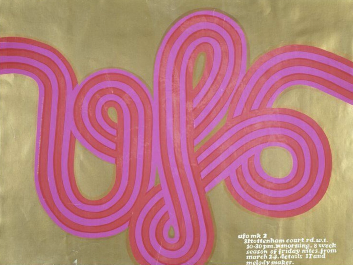
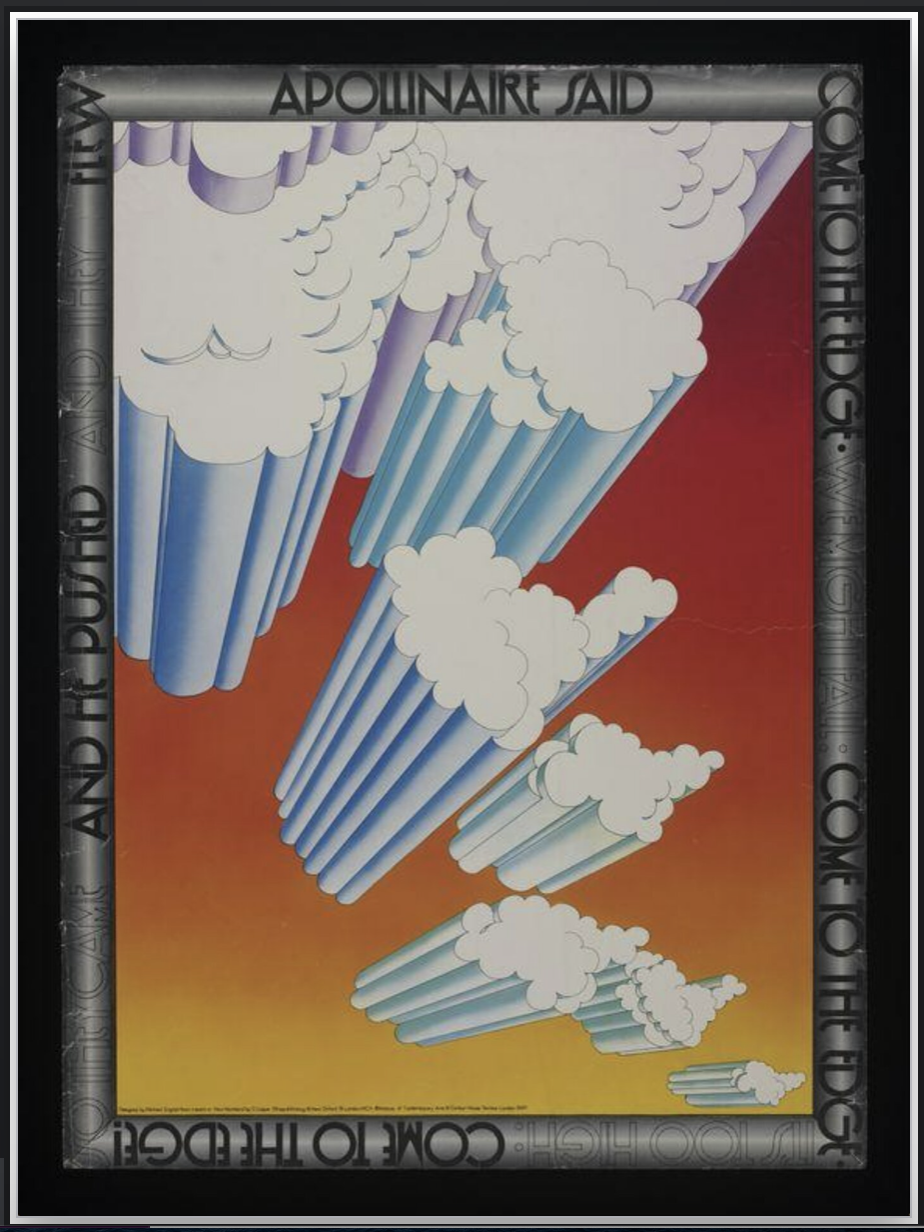
Such images deceive the brain and create a sense of movement in the paintings, hide some elements, show flashing, and vibrating patterns, deform the drawings or make them voluminous, disproportionate, too small or large, and create kaleidoscopes and patterns.
Acid colors
The more bright colors, the better for the artist’s eye. Red can be combined with yellow, orange, and contrasting purple, and they will all scream their importance in one work.
Lots of References
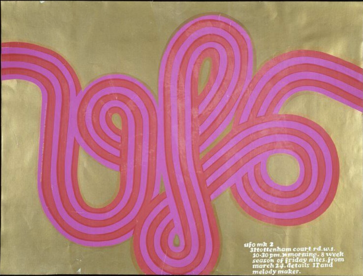
Trippy artists weren’t afraid to borrow images and sometimes didn’t even change them in their work. An example of it can be seen in this poster:
Special Symbols
In trippy art, a system of symbols has appeared that is often found in the works — flowers, guitars, pacific, the road, images of people, a hemp leaf, a Buddhist balance sign (yin-yang), a rainbow, a dove or a pigeon’s foot, long hair and colorful ornaments — everything these images come to life to develop into a special language in which the message sounds as clear as possible for those to whom it is addressed.
Incoherent stories.
Often posters and illustrations look fragmented and do not give any specific meaning. Therefore, it can be difficult to guess what exactly the artist had in mind (perhaps even nothing).
From Advertising to Art
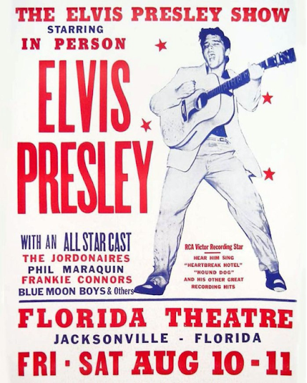
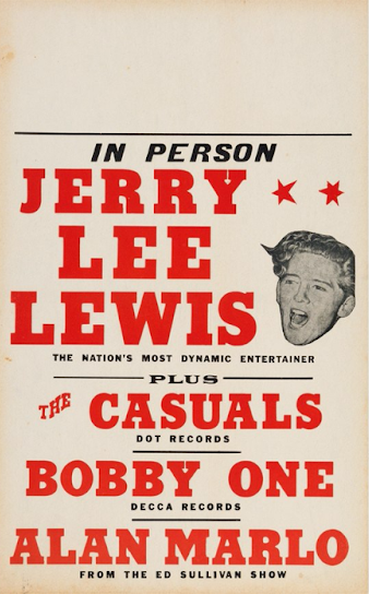
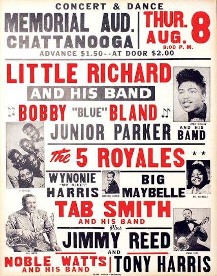
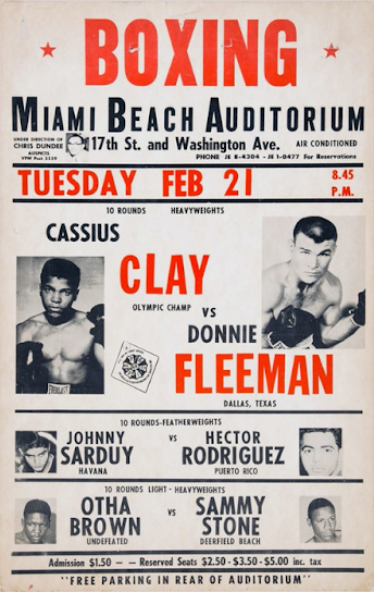
A special place in trippy art is occupied by posters that are directly related to. Even before the advent of LSD, in the middle of the 20th century, they looked like advertising and served one purpose — to sell. For example, tickets for concerts or sporting events.
A sparse design, a white background, flashy text, and a few photos — that’s all the designers’ tools are. Such posters from time to time began to be called boxing-style posters, regardless of the subject, as they did not differ much from each other.
Of course, there were also more creative images, but usually, they were associated with serious art events that were held infrequently.
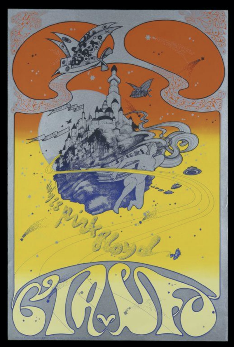
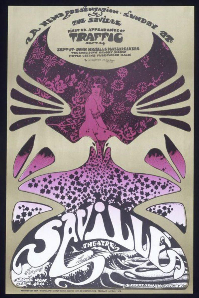
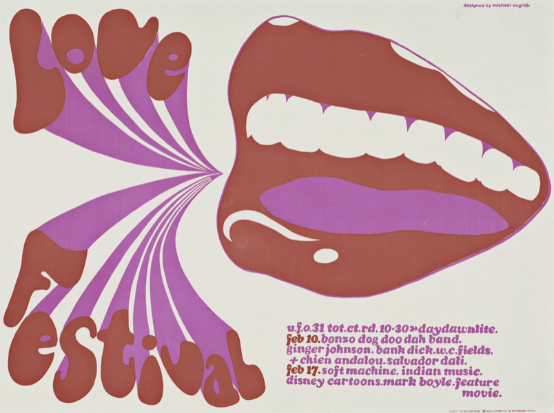
The design changed as the hippie and counterculture era began to develop. In Britain, the popularity of the new posters was at its peak in the 1960s and 70s. The most famous artists of this trend were Michael English and Nigel Weymouth. English created the “English form” of psychedelic art in the poster. It was he who absorbed optical illusions, the brightness of colors, images from pop art, and motifs from the works of Alphonse Mucha and Aubrey Vincent Beardsley into his art.
He worked with Nigel Waymouth. It was their duet, called Hapshash And The Colored Coat, that brought art and music together. They made album covers, posters, and concert posters, which now often appear in private collections.
In the USA the development of psychedelic posters took longer, until the 1990s. The art referred to complex social issues such as racial segregation, inequality, and the Vietnam War. Compared to the British, he looked more aggressive and flashy.
Important figures were the San Francisco artists Richard Griffin, Victor Moscoso, Stanley Mouse, Elton Kelly, and Wes Wilson. They were inspired by photographs of Hollywood stars, cartoons, comics, and eclecticism in every direction.
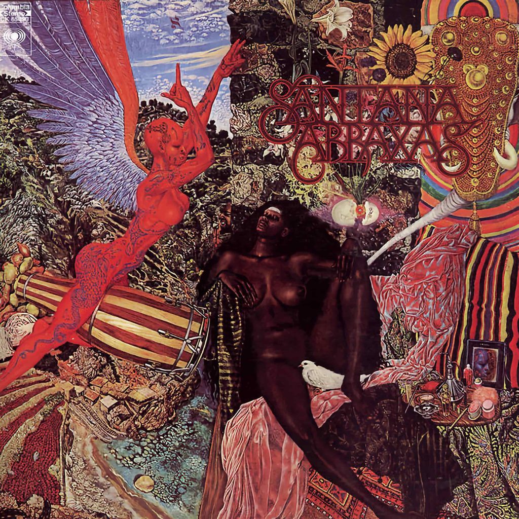
Wes Wilson is famous for his “psychedelic” fonts, which seem to blur across posters or melt in the sun. It was also he who came up with images for the musical group The Grateful Dead.
The Final Word
So, psychedelic art is a mosaic of different art movements, emotions from trips, references and visual distortions. The trippy art culture continues to influence art today, giving rise to new waves of artists who use psychedelics as a material, tool, or image.
